Dashboard Project Success Factors
In this post I will describe one critical dashboard project success factor; how to frame the reason for building the dashboard.
At the start of every dashboard project, I listen for a few signals that can predict if the project is going to succeed or fail.
By “fail” I mean that the customer’s investment in the project will not deliver the benefits they expect. The customer will stop using the dashboard, and the time and money they spent will be written off as “learning”.
A Dashboard Project Success Factor: What Problem Needs to be Solved?
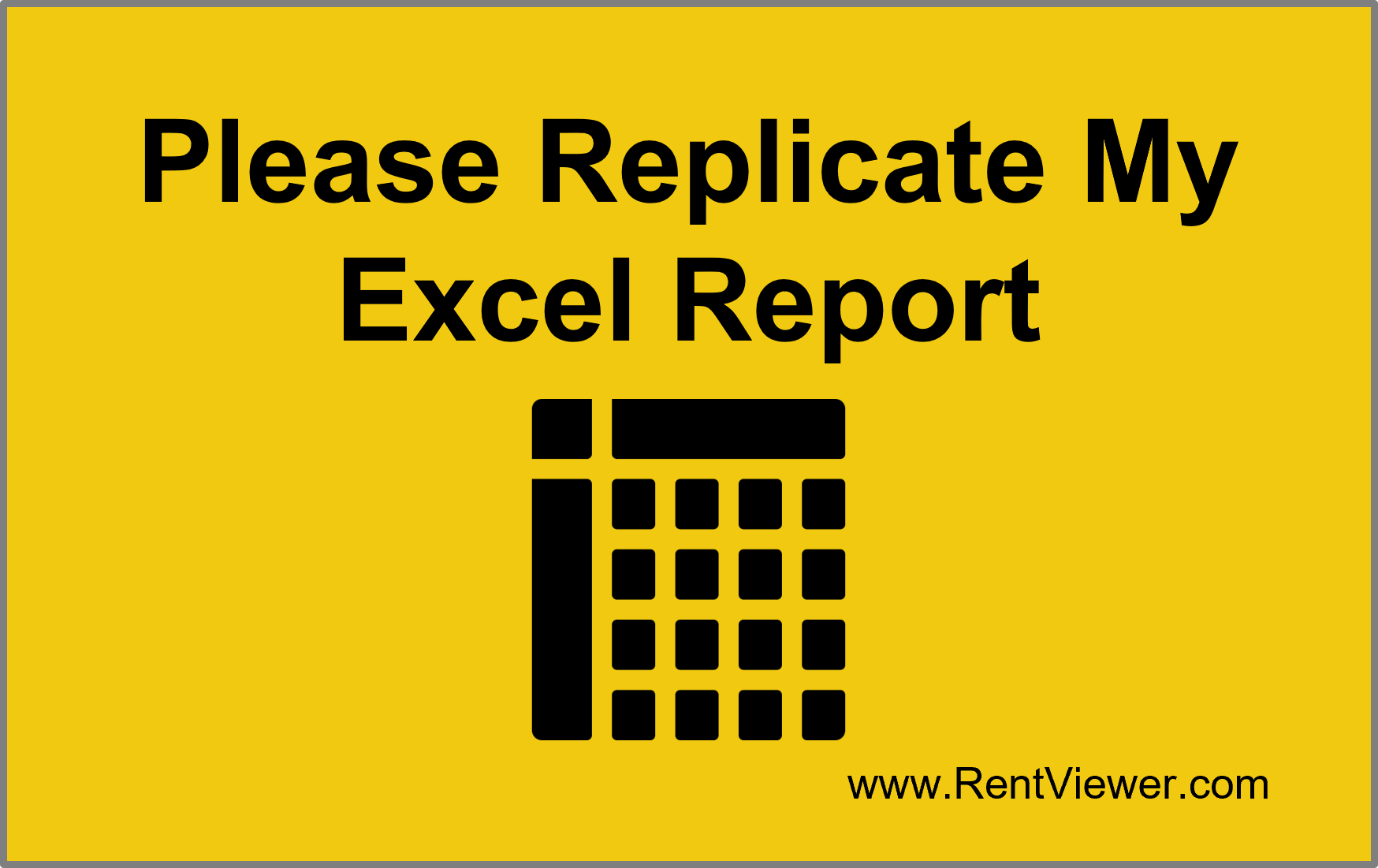
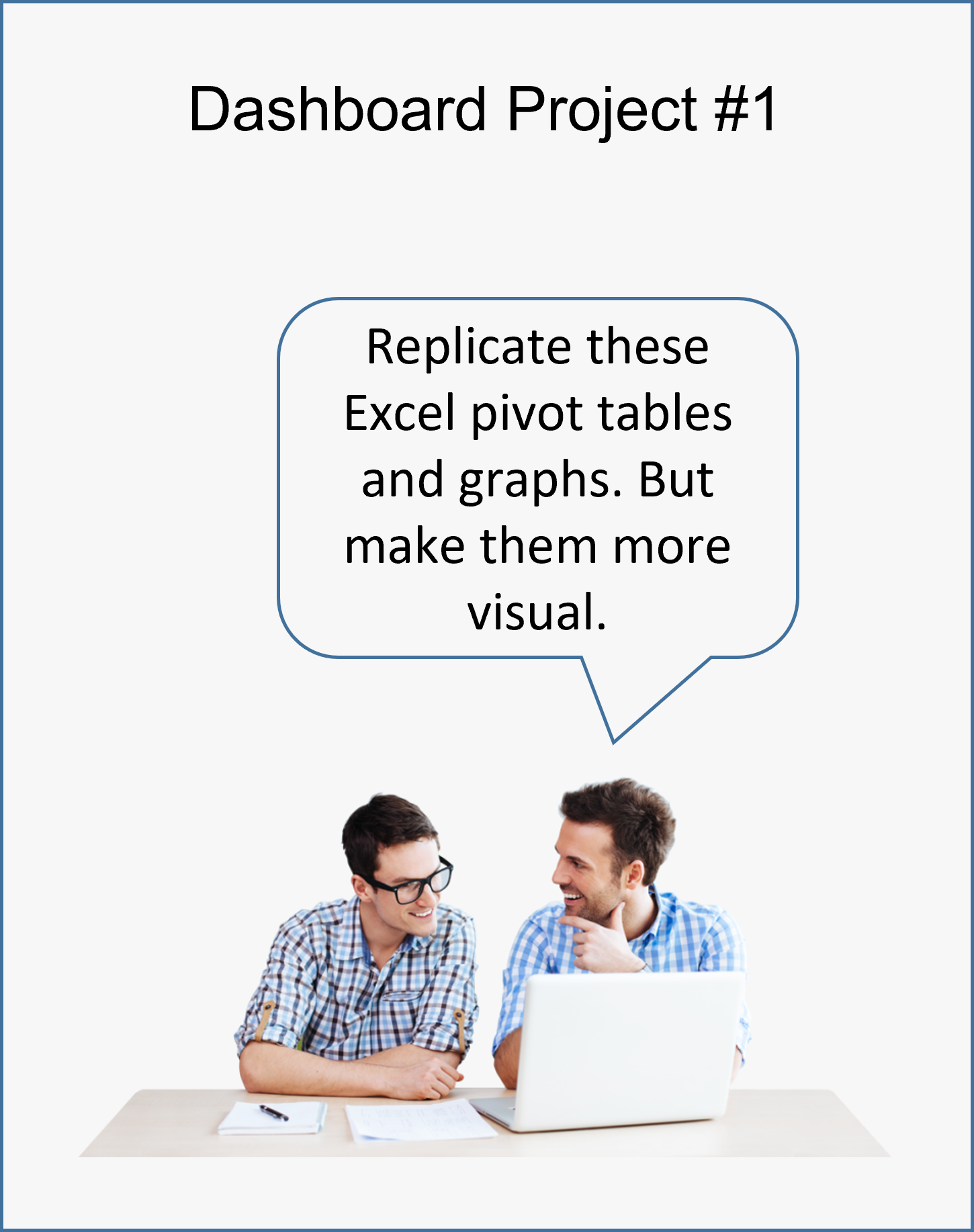
When the customer starts a project off saying “We have built pivot tables and reports in Excel. We would like you to replicate these for us (in Power BI or Tableau)”, that’s a big red flag!
Here are some reasons why starting a dashboard project in this way is a problem:
- Looking at a graph or table doesn’t tell me what use you get from it.
- Looking at the graph or table doesn’t tell me what questions it answers for you.
- Data visualization tools such as Power BI and Tableau open the door to many more possibilities than Excel can offer. If all you know is Excel, you might not be aware of what else is possible.
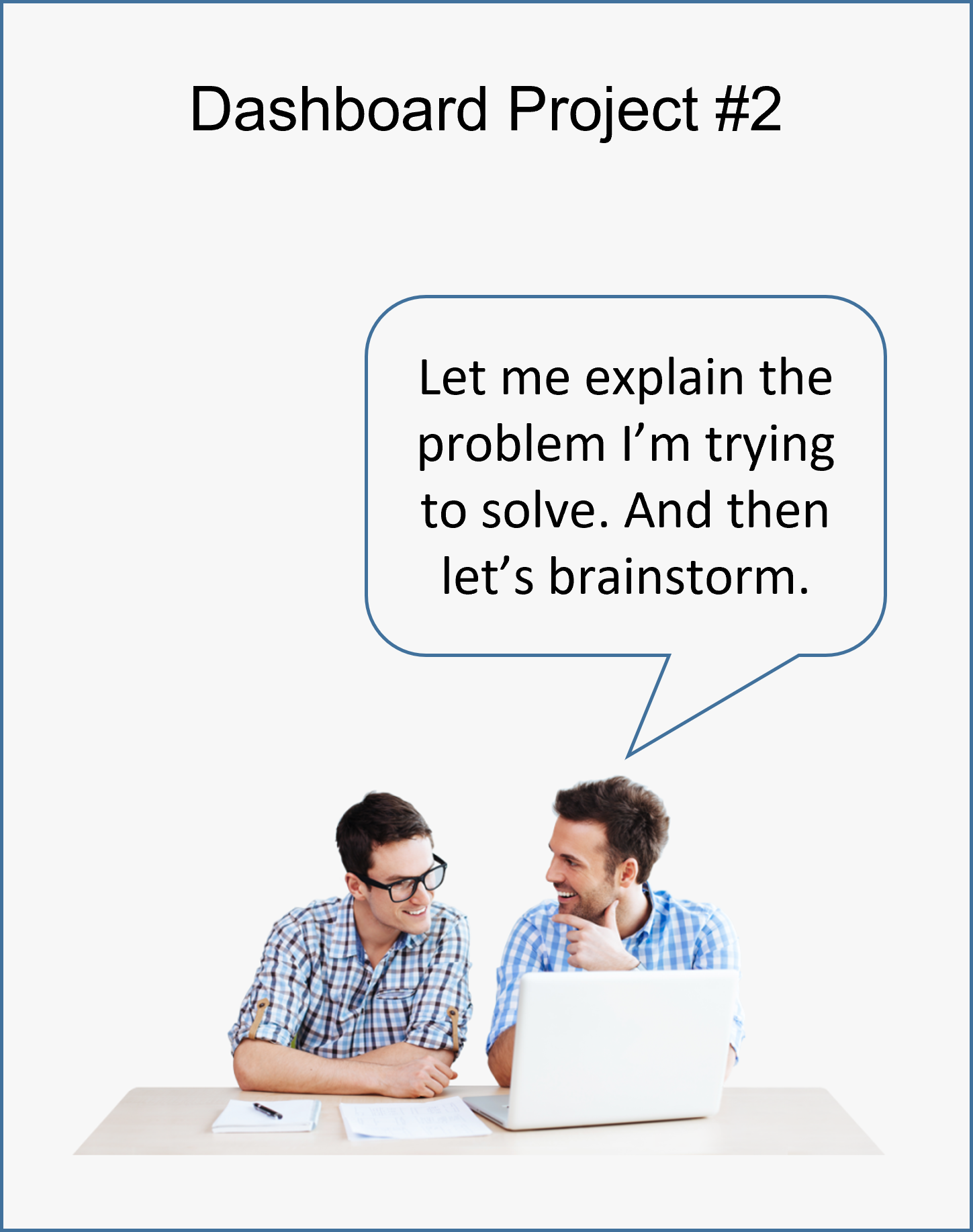
I need to understand what action you take when you look at the graph or table. Telling me to replicate something you’ve already built in Excel isn’t sufficient.
The Dashboard Usefulness Checklist
Dashboards should be designed such that the viewer can run through this mental checklist:
- Is there a problem that needs immediate attention?
- Has anything unexpected happened in the most recent time period?
- Was the goal achieved for the most recent time period?
- Are things trending in the right direction?
- Which factors (properties, accounts, etc.) are contributing the most to the variance?
How to State the Problem
Here are examples of how to state your requirements so that I can figure out the best way to help you:
- Build me a visualization that tells me which properties are below budget on NOI and Operating Income …. so that I can create a coaching plan for my property managers.
- I need a way to know which units are being rented below market and how much that’s costing me in Economic Occupancy … so that I can adjust rents before marketing the units.
- I’d like to see how long service tickets remain open and if there are specific ticket types that take longer than others … so that I can decide if we need to add more maintenance techs to our team.
- I’m not sure how much to budget for marketing next quarter …. So I'd like to see a visualization that shows how many leads we got from our advertising in each of the last few quarters, and how many of these leads were converted into leases?
In Conclusion
If you are able to articulate what you want to use your pivot table or Excel report for, you are more likely to get a Power BI dashboard or Tableau dashboard that you will actually use.
Browse this article on possibilities for visualizing data. Would KPI Cards, color coding based on thresholds, trending graphs, etc help to answer questions faster or in a better way?